


An Alt-Data Story Explainer
You probably won’t believe this story.
It’s a story that explains other stories. And because nothing can be so deceptive as a good story, you should pay close attention. Indeed, truth can be stranger than headlines. Story elements allure, but the plot that matters lies beneath.
Never let facts get in the way of a good story, so the saying goes. But to avoid deception, never let stories omit explanation.
News network anchors and newspaper headlines continuously report stories about why markets are moving. The stories change as markets rise and fall. As markets revert, stories recycle. Finally, at the height of deception, stories that once explained a rising market, explain a falling market.
Here’s a sampling of headlines explaining different market moves:
“Markets rise on COVID hopes.” - Barron’s, 8/28/20
“Global markets fall on COVID-19 worries.” - ABC / Reuters, 10/28/20
“World stock markets rise on inflation data” - Reuters, 5/28/22
“Inflation angst drags S&P 500 into bear market” - Reuters 6/13/22
“Global stocks in steep weekly retreat after central bank rate rises” - FT, 6/10/22
“Stocks rise after the Fed takes historic action on inflation” - CNN, 6/15/22
Before the recent confluence of pandemic, inflation, and interest rate news cycles, media and newspapers substituted other topics to explain the same market movements. Russia and Ukraine, unemployment, and of course Elon Musk.
Pick a topic and match it to a market move.
“Twitter falls, wipes out all gains since Elon Musk disclosed his stake.” Mint - 5/16/22
“Twitter jumps after Musk increases commitment in takeover bid.” CNBC, 5/25/22
There is little debate about whether inflation, interest rates and Elon affect markets. But using headlines to explain markets is suspect when they are indifferent to market direction.
When every topic can be used to explain every market movement, they do not explain any market movement. So too with models, from The Color of Greed and Fear:
“If a sample of Apple tweets could be converted into emotions that produced meaningful information through an off-the-R-Studio-shelf sentiment model, it could explain anything. And a model that explains anything explains nothing.”
When themes and characters change while stories remain the same, apply scrutiny. Maybe there is a better explanation for the direction of $185 billion in daily transactions between buyers and sellers that make up the $49 trillion U.S. equity market. Maybe there is a more credible story.
A story where themes are continuous auction markets and best execution regulatory requirements. Characters are greed and fear, demand and supply. And climaxes and resolutions are a dance between performance and risk management.
This story is about seeking an objective explanation for market movements independent of news cycles. As with stories, what matters with analytics lies beneath.
Insight and signals rest atop explanatory data. Selecting data is like choosing theme and plot. The wrong data creates boring stories at best and untrue stories at worst. Useless analytics. The right data creates characters, tension, climax, and resolution that form meaningful stories. Useful analytics.
Equities are transferred between market participants operating in a complex system of networks. Exchanges, alternative trading systems, electronic communication networks, crossing engines, and voice brokers are network nodes connecting buyers and sellers. They use primitive and cutting edge technology in an intensely regulated environment where users are willing to tunnel cable across the country to reduce communication latency measured in milliseconds1.
Lying beneath this system are two data sets known by 3-digit codes, 605 and 6062. The codes and their underlying data are the product of the Securities and Exchange Commission (SEC) Disclosure of Order Execution and Routing Practices rule. From the SEC:
The Securities and Exchange Commission is adopting two rules to improve public disclosure of order execution and routing practices. Under Rule 11Ac1-5, market centers that trade national market system securities will be required to make available to the public monthly electronic reports that include uniform statistical measures of execution quality. Under Rule 11Ac1-6, broker-dealers that route customer orders in equity and option securities will be required to make publicly available quarterly reports that, among other things, identify the venues to which customer orders are routed for execution.
Also beneath the system is FINRA Reg SHO short sale volume data. From FINRA:
Pursuant to a U.S. Securities and Exchange Commission request, FINRA makes short sale trade data publicly available for off-exchange (i.e., OTC) trades in exchange-listed securities reported to a FINRA Trade Reporting Facility (TRF) or the Alternative Display Facility (ADF), as well as for trades in securities traded over-the-counter and reported to FINRA’s Over the Counter Reporting Facility (ORF).
Beneath market activity is market structure. And beneath market structure is market structure data. 605 best execution, 606 order routing, and FINRA Reg SHO short volume. Market structure sentiment. Demand and supply.
The data that explains the stories.
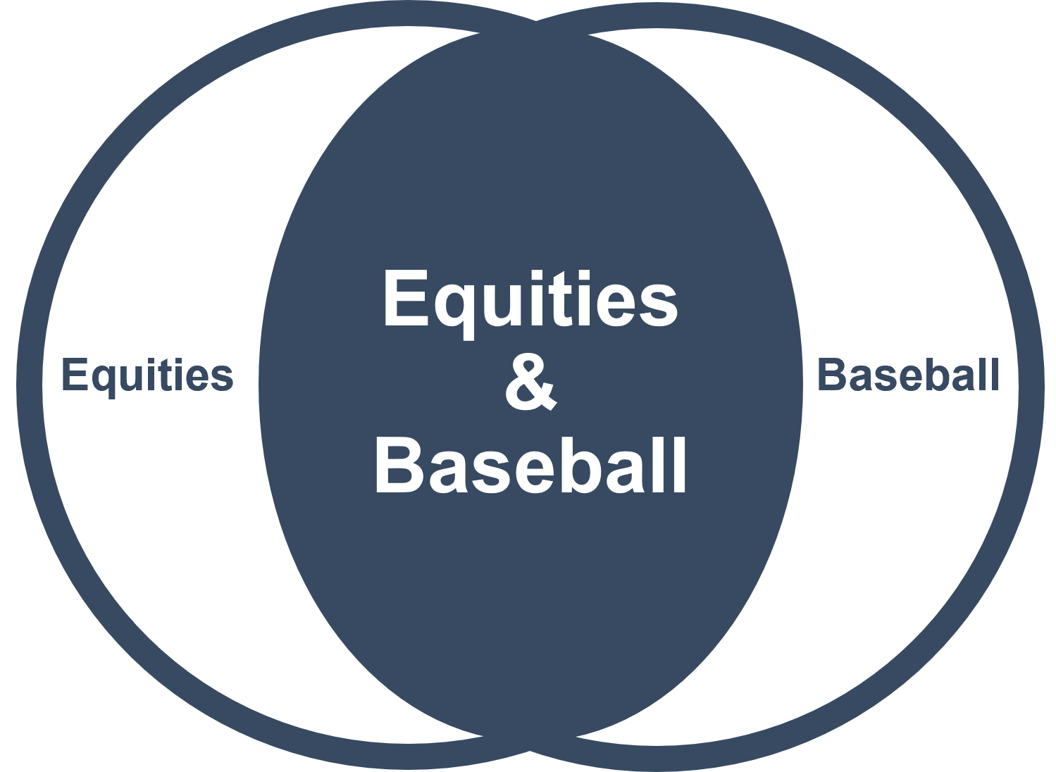
Analogies can be imperfect and helpful. I will attempt to use one here. Readers familiar with Michael Lewis’ Moneyball3 will have an interpretation edge. Moneyball is the baseball economics story of how analyzing fundamental player statistics changed the game. And for better or worse, the Venn diagram crossover of equities and baseball is likely material.
Ok, onto the analogy, here goes:
The old school baseball scouts in Moneyball were observing baseball players. Watching their swing, watching their bat-speed, watching them run, watching them respond to interview questions after the game. These observations make for great stories that can be used to buy and sell players.
But these stories are very different from the story told by on-base-percentage4 (OBP). OBP is universal, it is ingrained in the fundamental mechanics of baseball and statistically meaningful in determining player productivity.
Scouts watching bat-speed is not statistically meaningful. It is a bit like watching commentators reading headlines.
Billy Beane, General Manager of the Oakland A’s, combined Moneyball statistical principles with a budget one third the size of competitors to field a winning team. The A’s reached the playoffs in four consecutive years (2000 - 2003) and became the first American League team in over 100 years to win 20 consecutive games.
Data signal replaced scouting noise.
Trying to explain market behavior without market structure sentiment is like trying to evaluate a baseball team without OBP information. Likewise, buying and selling securities without understanding market structure sentiment is like buying and selling baseball players without understanding OBP.
To complete the imperfect analogy, baseball GMs using OBP to optimize team selection is like asset managers using market structure sentiment to optimize portfolio management. OBP informing rosters is like market structure sentiment informing stock selection, position size, and entry and exit decisions.
Market structure sentiment signal can replace headline noise.
If you want to tell useful stories with data, you need the right data. And if your goal is to tell a meaningful, explanatory story about market movement, that data must include the underpinnings of what makes our markets function. Data representing market participants where actors behave according to regulatory requirements.
This fundamental data may sound boring because it lacks the intrigue of alarmist headlines. No one on CNBC is pining on about divergences in 605, 606, or Reg SHO data that might explain, in terms of central tendencies, the probabilistic likelihood of market strength or weakness.
Well, actually, one person is. But they air him at 5am when most of CNBC’s audience is asleep. He’s the eccentric bloke we invited to the BSTA conference last year, Tim Quast. Here’s Tim explaining market structure on CNBC:
At the 3:40 mark, Brian Sullivan from CNBC makes a candid statement about the forces that drive current-thing headline stories:
“You kind of just described what is often the frustrating part of our job, which is trying to find a headline. We can’t come on the air and say, ‘I don’t know.’”
Brian, we have the solution.
I explained our partnership with Tim in the afterword of The Secret of Free Data:
Together we’re enriching market structure sentiment analytics. And we’re designing a more complete investor relations dashboard combining market structure with earnings, ESG, and news information.
Like our BSTA panel, our goal is to educate and help those who can benefit from a truer understanding of how market structure explains market behavior
Transforming best execution and short volume data into a demand supply framework of market behavior is as exciting as market structure gets. And its implications on investment processes is an unbelievable portfolio analytics story.
Stories require balance. Good and evil. Love and hate. War and peace.
Our market structure story is balanced by demand and supply. Proxies for best execution and short volume routing information. It’s market rules and regulations all the way down.
Stories flow from characters to theme within a conceptual arc. Plot ties it all together. Our plot is market structure sentiment. And our story flows from SEC filings to market participant activity to portfolio optimization. The conceptual arc is made up of filings that create rules that govern behavior that produce orders that explain activity.

These are the fundamental mechanics of the equity market and statistically meaningful in explaining activity. This is the market structure equivalent of on-base-percentage.
So how does one use market structure sentiment?
Instead of watching headlines and talking heads, analyze market structure demand and supply trends. Understand whether demand and supply are rising or falling. Interpret their relationship to one another and their level of divergence. Is demand rising while supply falls? Is the inverse true? Or are demand and supply moving in sync?
Analyze stocks, sectors, and broad market sentiment. Compare the relative strength of portfolios to each other and to the broad market. Use demand and supply flow indicators to understand what percent of portfolio and market sentiment is rising or falling.
Use market structure information to optimize portfolio turnover. Use it to inform position sizing, portfolio tilting, and trading strategy aggressiveness. Use it to deliver new and meaningful insight to clients.
You won’t find these characters in the headlines. And you won’t be able to benefit from understanding their influence if you are watching the wrong stories. Do not underestimate the value of allocating attention to the right story.
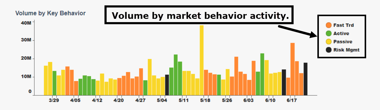
Let’s look at the tension in our story. From our plot told through regulatory data (the anti-headline), we come to market structure behavior classifications. Our story’s real heroes and villains.
- Fast trading
- Active
- Passive
- Risk management
These characters lie beneath media hyperbole, spurious headlines, and bloviating pontification. Like scouts listening to a ball player in a post-game interview, listening to headlines misses what actually explains the market.
These characters are in our story too. Their behavior across our data-prose can be identified through analysis. They can be grouped into market structure profiles that rise and fall in power. And they produce demand and supply flows that connect our plot and theme to the concept of market structure sentiment.
Now one can act based on an understanding of how these characters explain stocks, portfolios, and markets.
This is Moneyball for market structure.
Let’s explore some scenes. Portfolios are typically groups of stocks classified by industry, sector, or investment style. These groups are merely supporting characters, background extras, and in video game parlance, NPCs (Non-Playable Characters).
Static classifications make for static analysis.
Classifying portfolios by market structure sentiment groups stocks by market behavior characteristics. These groups are alive and change over time.
Dynamic classifications enable dynamic analysis.
Transforming 605 best execution, 606 order routing, and Reg SHO short volume information into demand and supply is like transforming Brad Pitt into Billy Beane to explain Moneyball.
Demand sentiment is modeled on a scale of 1 to 10, giving our character an emotional range to explore. Short volume supply is measured in percentage terms, exposing how short, or anguished, is our character.
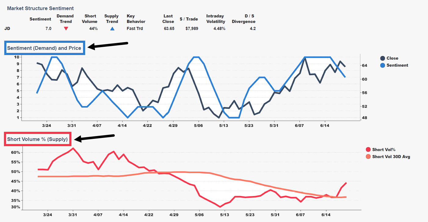
We’ve unveiled the axes around which the market revolves: demand, supply, activity, and price. Headlines and current-thing stories have been stripped away. If markets care about interest rates, or unemployment numbers, or fed minute commentary, demand and supply will tell us. It will be in the lines of our characters.
Likewise, in times when the market does not care about interest rates, or unemployment, or the fed, our characters will tell us with different lines that diverge from current-thing headlines.
Once we understand demand and supply are driving the story, we must only pay attention to what they are telling us.
Jim Cramer, Bob Pisani, Maria Bartiromo, and your favorite Bloomberg analysts are talking about headlines that distract from market explanations.
If you take nothing else away from this story about stories, let this be the point that resonates. Almost universally, on a scale so grand it is taken for granted, markets are being explained by distractions.
Character misdirection in a great story creates tension and suspense before being resolved. Like when the audience learns the secret to The 6th Sense. But market headline misdirections snowball from one media outlet to another without resolution.
They move the narrative from one current-thing to the next current-thing until a real story like the Big Short explains what happened. By which time everyone forgets all the current-thing headlines that were misused to explain the market.
Demand and supply characters remain unexamined while Michael Lewis, who authored Moneyball and The Big Short, pieces together the story that sat atop the data of prior markets.
Meanwhile, our characters remain active, underlying current market conditions that will lead to the next market events. And because they are misunderstood, or worse, ignored to focus on more tantalizing current-thing headlines, the cycle repeats. Not always with the magnitude of the Big Short, but over and over again, across market moves big and small.
Such is the allure of current-thing headlines. Because they are current and time is ephemeral, they are always here. Always now. And always fighting for our attention. But they are a distraction from the behaviors that drive the market.
These are the scenes we live in. And as we create buy and sell orders, we become part of the story. We may as well study the script.
Let’s return to our characters.
Active and passive money, fast trading, and risk management. These are the players who leave traces on 605, 606, and Reg SHO data.
Volume is a single number representing shares traded. And activity alone is meaningful. A great amount of time and analysis is focused on volume statistics. Up-volume, down-volume, increasing or decreasing volume, on-balance volume, accumulation distribution, money-flow, and of course, the great VWAP, volume-weighted average price.
All these volume measures fail to account for the players. They disregard the characters driving the plot. It’s like analyzing a story’s prose without knowing who is speaking. Surface level market activity is an abstraction of market participant activity. It’s the type of analysis that can lead to spurious conclusions.
Look at Coinbase. Market structure sentiment demand was on the floor for weeks amid passive and fast trading activity. Then there was a surge of volume driven by risk management - money tied to options, futures, and other derivatives that warp prices.
After the market closed on 5/11 Sam Bankman Fried (SBF), former Jane Street trader and current billionaire owner of Cryptocurrency Exchange FTX, announced a stake in Robinhood. Guess what the headlines reported? Robinhood - and its peers like Coinbase - traded higher on news that SBF purchased 5% of HOOD.
But something more interesting happened prior to and underneath the headlines. COINs market structure sentiment profile changed. On 5/11 short volume supply peaked at a lofty 68%. And total volume capitulated with a surge in risk management activity. Over the next several weeks demand sentiment went from 1 to 10 and supply fell 15%.
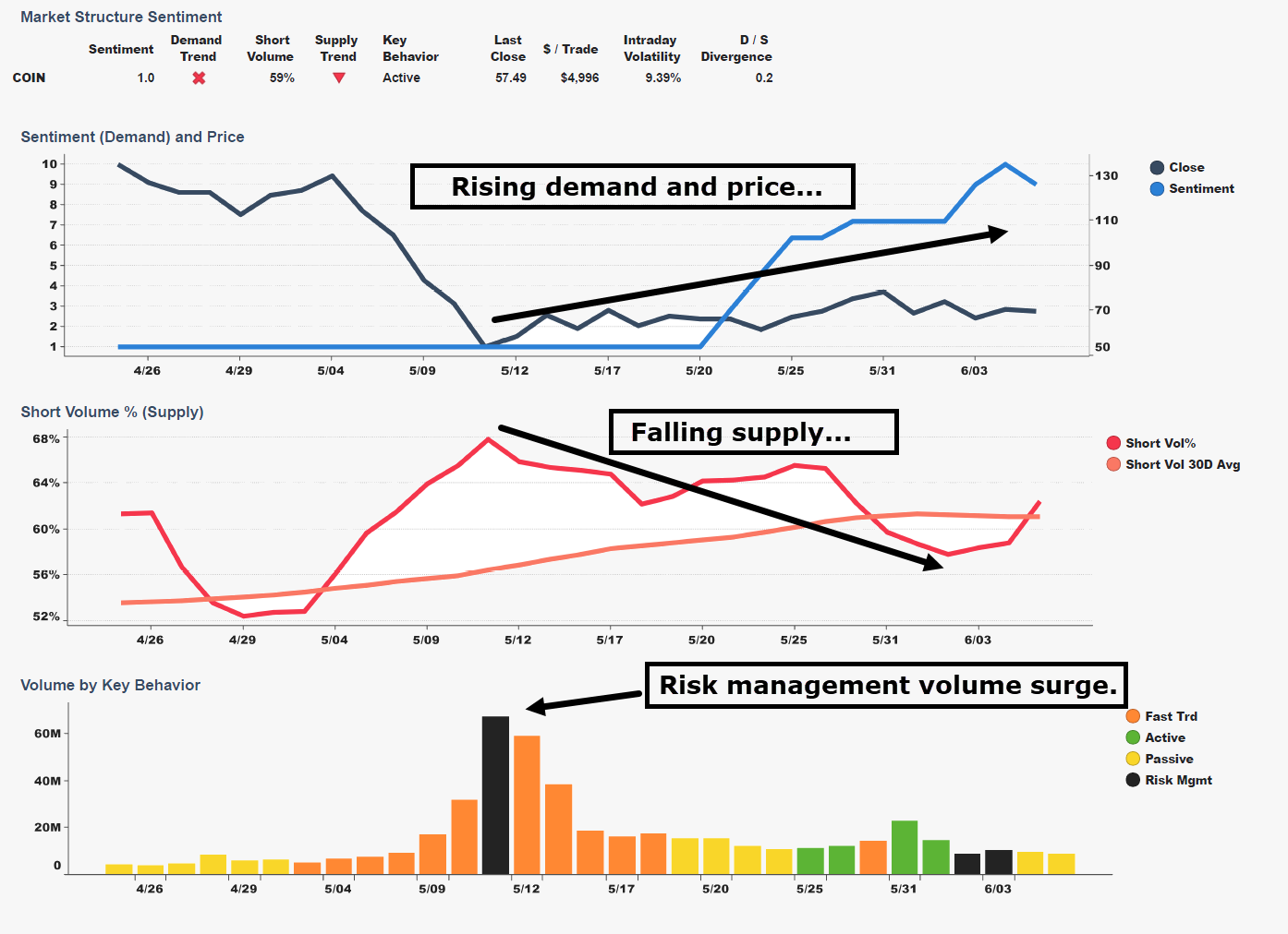
From 5/11 to 5/31 COIN appreciated 45%, trading from 53 to 78.
By transforming market structure activity into basic economics5, we can understand the characters driving market tension and resolution. This is what lies beneath the headlines. Current things sit atop real things.
Maybe you don’t believe it. I said you wouldn’t believe it. How could an entire industry of market experts overlook the real story of market activity? Maybe the same way experts overlook basic fundamentals underlying health, politic, and violence.
One must be careful trusting experts.
Our market structure behavioral groups produce a social experiment. They align in regimes, large and small, and their movement over time influence capital markets.
These regimes are the war armies, political movements, and religious classes of the market. And just as one must understand war, politic, and religion to explain the world, one must understand market regimes to explain the market.
Breadth and flow are regime characteristics. Breadth measures the number of components rising and falling. Flow captures breadth movement across regimes.
Our regime market structure classifications include demand and supply direction, topping and bottoming action, market behaviors, and demand supply quadrants. Think of the quadrants as typical 2-by-2 consulting diagrams, except useful. Here are the quadrants:
- Up and to the right: high-demand, low-supply (bullish)
- Up and to the left: high-demand, high-supply (neutral)
- Down and to the right: low-demand, low-supply (neutral)
- Down and to the left: low-demand, high-supply (bearish)
Individual stocks can be tracked across quadrants over time and compared to portfolio distributions. Two quadrants expose market structure behavior where demand and supply diverge. And two quadrants capture demand and supply moving together - what Tim Quast refers to as muted upside and muted downside.
Great stories conjure great images in our imaginations. Artists turn the images into paintings, film, video games, and more. We turn this story into images too. Demand and supply. Greed and fear. Explanations.
Nobody at CNBC, the Wall Street Journal, or in the Twitterverse are looking at these pictures to help explain markets. Because the images don’t match current-thing headline stories. The experts are looking at other pictures.
If every picture tells a story, and if stories are explanations, one should be discerning about to which pictures they allocate attention. Market structure pictures are images of significance orthogonal6 to current thing headlines.
The position that market structure sentiment matters more than headlines is a relative claim. The corollary is not that headlines are insignificant.
Rather, the position is a claim that there is value in understanding headlines sit atop first order market structure principles. Fundamental characters beneath the stories.
Think of this story I said you wouldn’t believe. Imagine if demand and supply characters modeled from the very rules that govern market behavior were real and if understanding them could help explain performance and risk. Consider the implications on assessing portfolio health, position size, and entry and exit points.
Awareness is alpha.
Despite our analogy’s imperfection, Moneyball’s subtitle could also be our story’s subtitle. “The Art of Winning an Unfair Game.”
What lies beneath matters.
Thanks for reading Focus Signal. Please subscribe for free to receive regular updates.
1 The first chapter tells the story of a $300 million project from Spread Networks that was underway in mid-2009—the construction of an 827-mile (1,331 km) fiber-optic cable that cuts straight through mountains and rivers from Chicago to New Jersey—with the sole goal of reducing the transmission time for data from 17 to 13 milliseconds. Flash Boys by Michael Lewis. (A millisecond is one thousandth of a second. And yes, it’s a Michael Lewis triple.)
2 605 and 606 are shorthand for legacy SEC codes 11Ac1-5 and 11Ac1-6.
3 Moneyball is a quest for the secret of success in baseball… Michael Lewis follows the low-budget Oakland A's, visionary general manager Billy Beane, and the strange brotherhood of amateur baseball theorists. They are all in search of new baseball knowledge―insights that will give the little guy who is willing to discard old wisdom the edge over big money.
4 On Base Percentage (aka OBP, On Base Average, OBA) is a measure of how often a batter reaches base. It is approximately equal to Times on Base/Plate appearances. The full formula is OBP = (Hits + Walks + Hit by Pitch) / (At Bats + Walks + Hit by Pitch + Sacrifice Flies)
5 Basic Economics by Thomas Sowell is a citizen's guide to economics for those who want to understand how the economy works but have no interest in jargon or equations.
6 Orthogonal is a fancy word for statistically independent. Fancy words generally make writing suck, but in this case it reduces syllables by 50% and passes the brevity test by omitting needless words.
.png)


